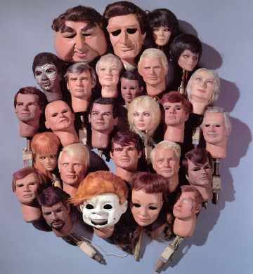
i didn't have a lot of time, and there are clearly things I'd fix on this design, but all in all I'm pretty ok with the illustration and look of it. For one, I would have hand drawn the instruments and stuck a drum in there somewhere...but oh well, the deadline was March 15th and I barely squeaked in. Good practice, me thinks. Now let's see if my poster design is actually chosen...


2 comments:
holy cats! what i've posted is NOTHING color wise close to what the original looks like. For one, the pink is more dusky and the red letter is actually plum purple... ah well. this version is a bit more technicolor, to say the least!
Awesome design. It looks great!
Post a Comment